OG ROLLS
Client
OG Rolls Bakery
Country
Australia
scope of works
Brand Strategy
Brand Identity
Motion
Marketing Campaign
Credits
AD | Chiêu Anh Long
Team Leader | Nguyễn Hiền
Brand Designer | Nguyễn Ngọc Hoài Thương
Brand Designer | Hà Tùng Lâm
Brand Designer | Poyo
Brand Designer | Hân Ngô
Illustrator | Nguyễn Ngọc Hoài Thương
Illustrator | Thái Hồng Ngọc
Graphic designer | Nguyễn Phan Quỳnh Như, Nguyễn Nhật Vy, Huỳnh Nguyễn Gia Trí, Huỳnh Thị Thảo Nguyên, Lê Ngọc Thảo Trang, Lê Ngọc Hạ Vy, Nguyễn Dương Mỹ Lệ, Nguyễn Thành Tín, Nguyễn Lê Bảo Ngân, Kado, Huỳnh Yến Nhi, Trần Quang Huy
Showcase designer | Lê Hữu Tiến
Showcase designer | Trần Đoan Trinh
The brief
OG Rolls is a neighborhood bakery in Australia, located within a supermarket environment and serving a broad, everyday audience. The brand was already familiar to returning customers, particularly families with low to middle income, who value affordability, consistency, and comfort.
The challenge was to rebrand OG Rolls without losing this recognition - while elevating its presence to stand out among dense, visually competitive supermarket brands.
The challenge
How might we evolve a familiar, functional identity into something more distinctive and engaging - without alienating existing customers? The brand needed to balance two tensions:
- Familiar vs. New - retaining trust while introducing a fresh perspective
- Accessible vs. Creative - staying affordable and friendly, yet visually strong enough to compete in a crowded retail context
Strategic approach
We positioned OG Rolls around the idea of “freshly baked, everyday” - emphasizing reliability, warmth, and daily relevance rather than occasional indulgence.
From a brand perspective, we leaned into the Everyman archetype: approachable, honest, and down-to-earth. This allowed the identity to feel inclusive and familiar, while still leaving room for a more refined and intentional visual system.
The strategy focused on:
• Preserving key recognizable elements from the old identity
• Simplifying and clarifying the brand message
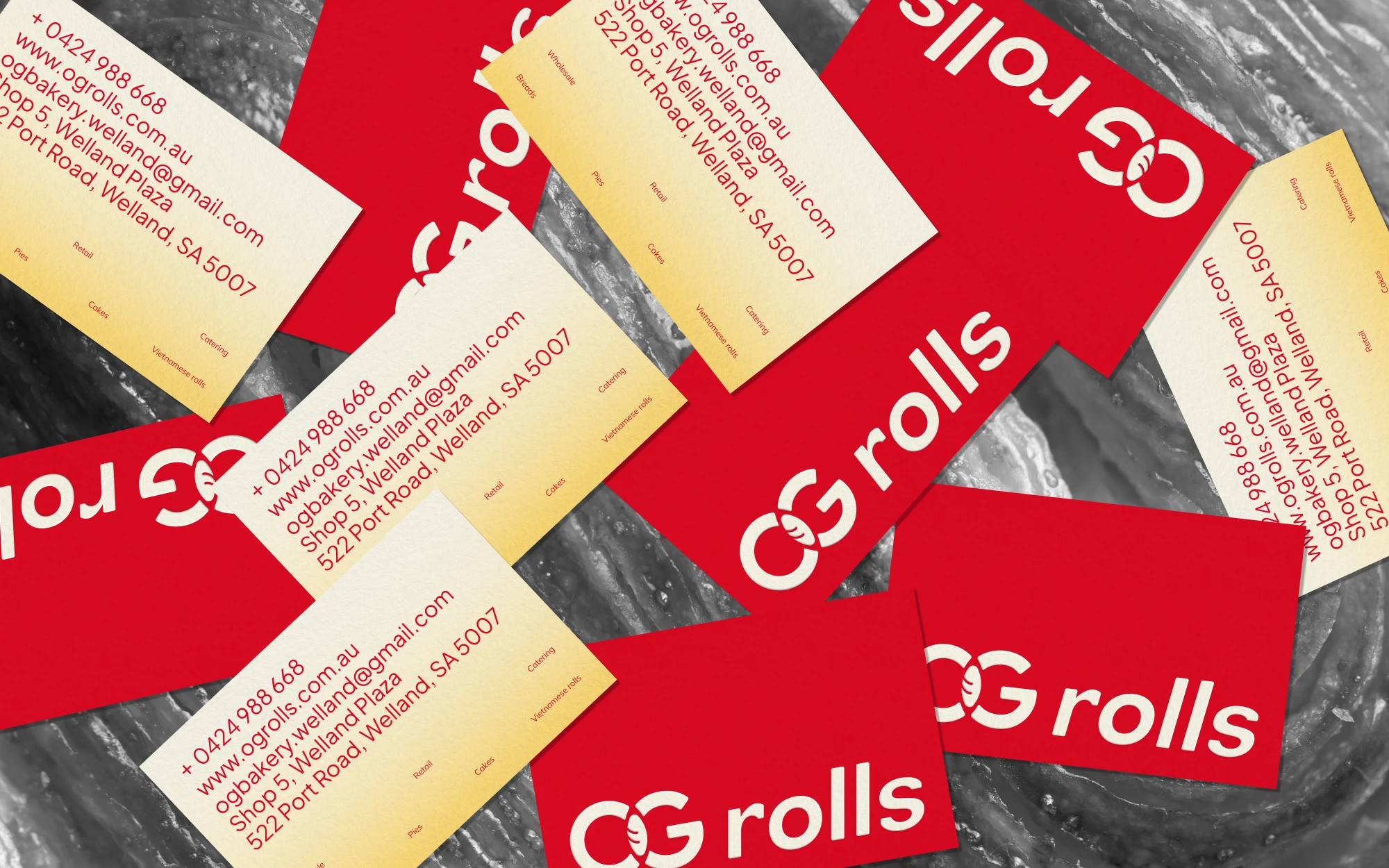
• Creating a system flexible enough for both in-store visibility and everyday touchpoints
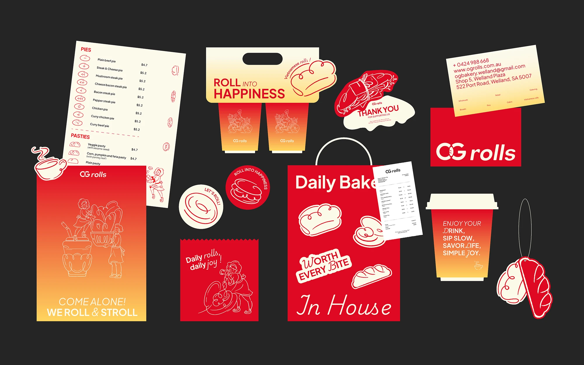
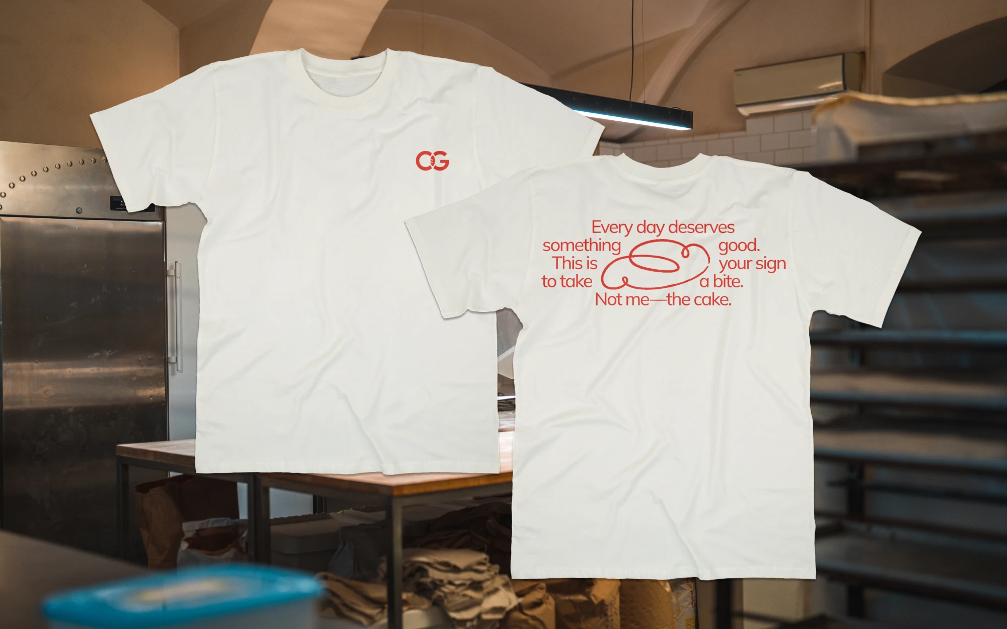
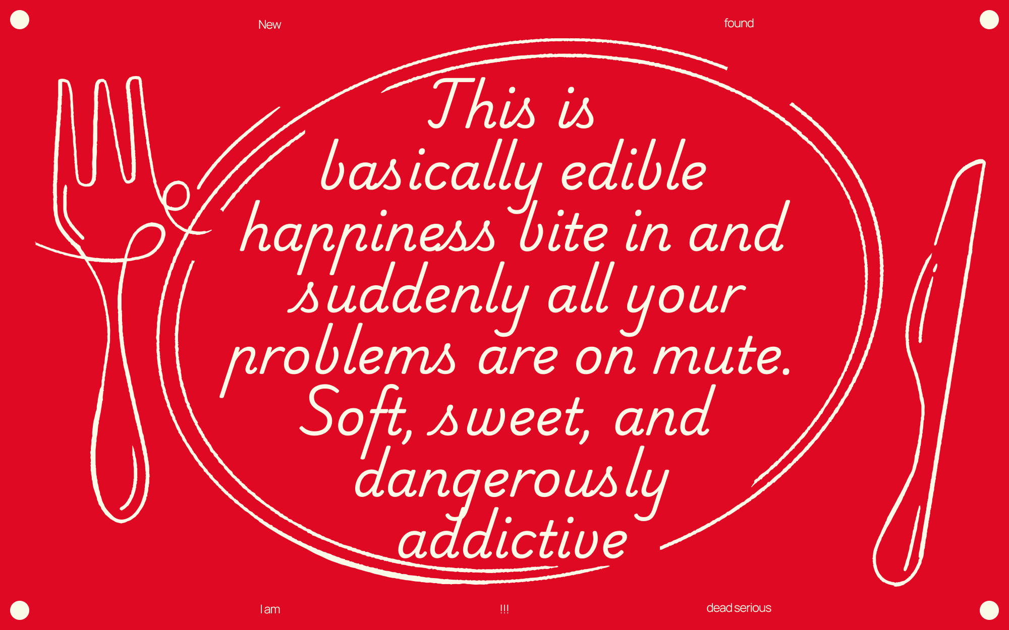
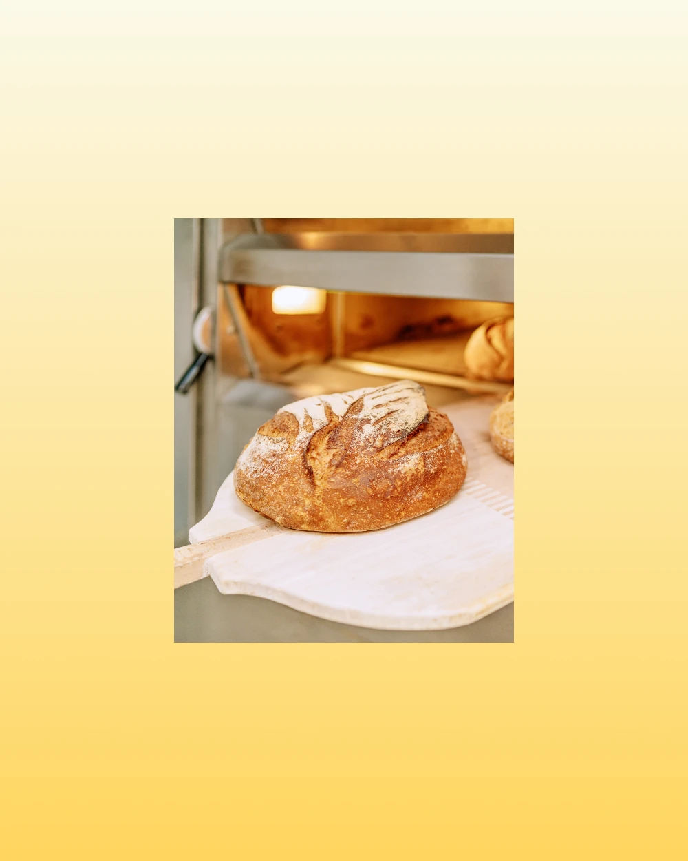
From a design perspective,
The system uses bold, warm colors and clean layouts to evoke heat, freshness, and appetite, while maintaining a friendly and down-to-earth tone aligned with the Everyman archetype. From a marketing angle, OG Rolls is positioned as part of a daily routine- quick, comforting, and consistently good - rather than a premium, occasional indulgence. Vietnamese-inspired recipes are subtly embedded into the offering, reinforcing cultural relevance without overcomplication.